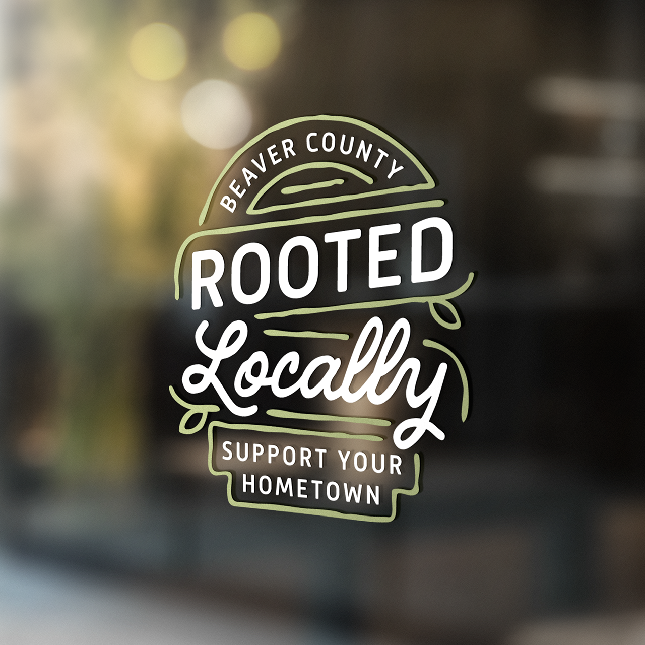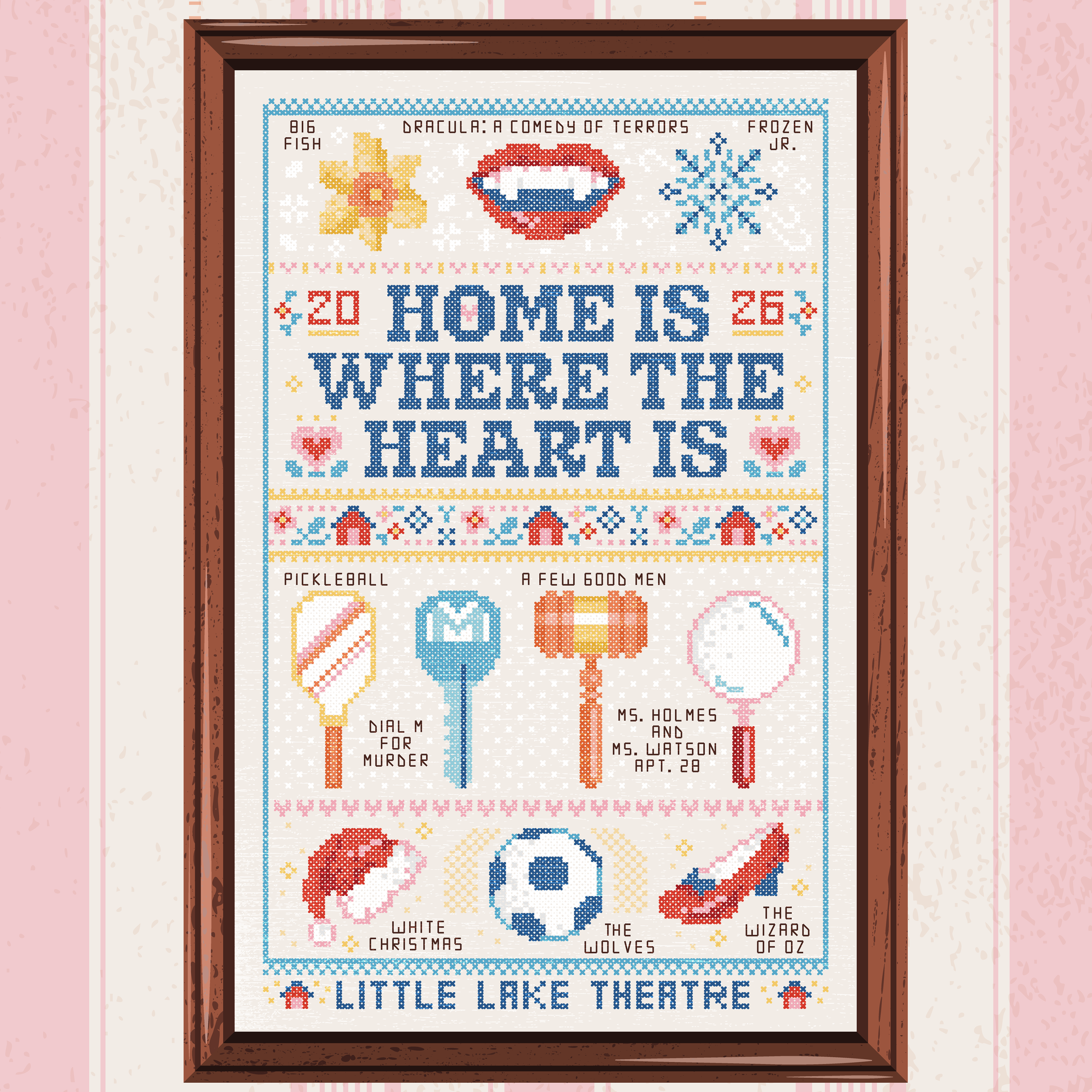
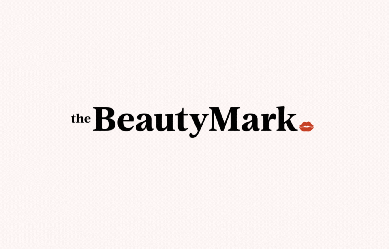
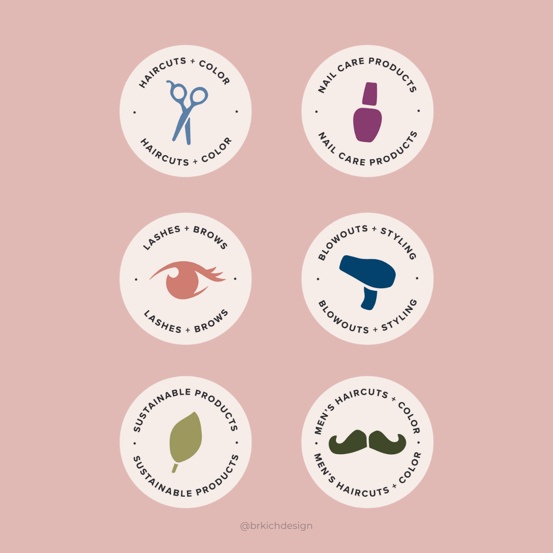
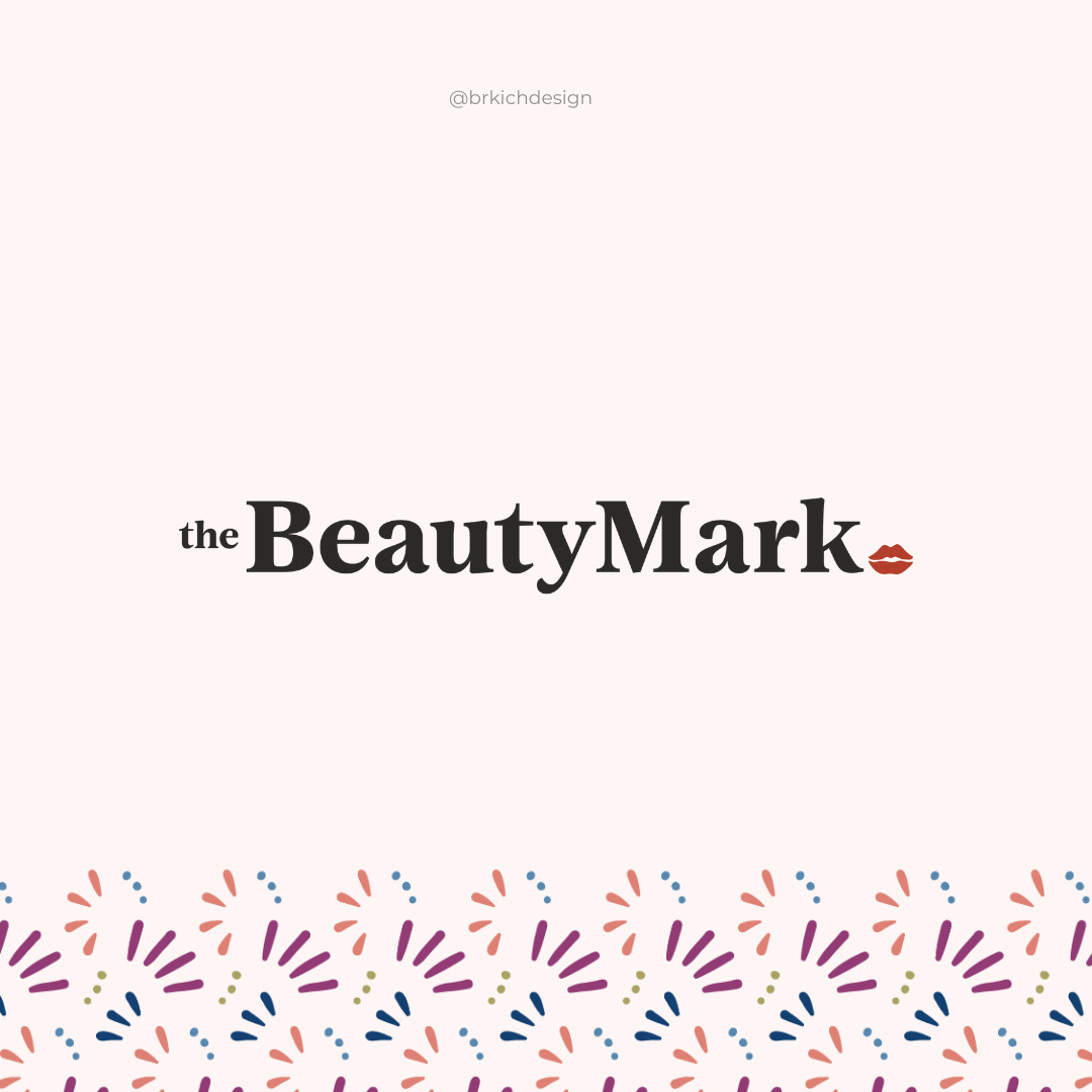
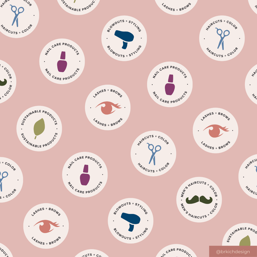
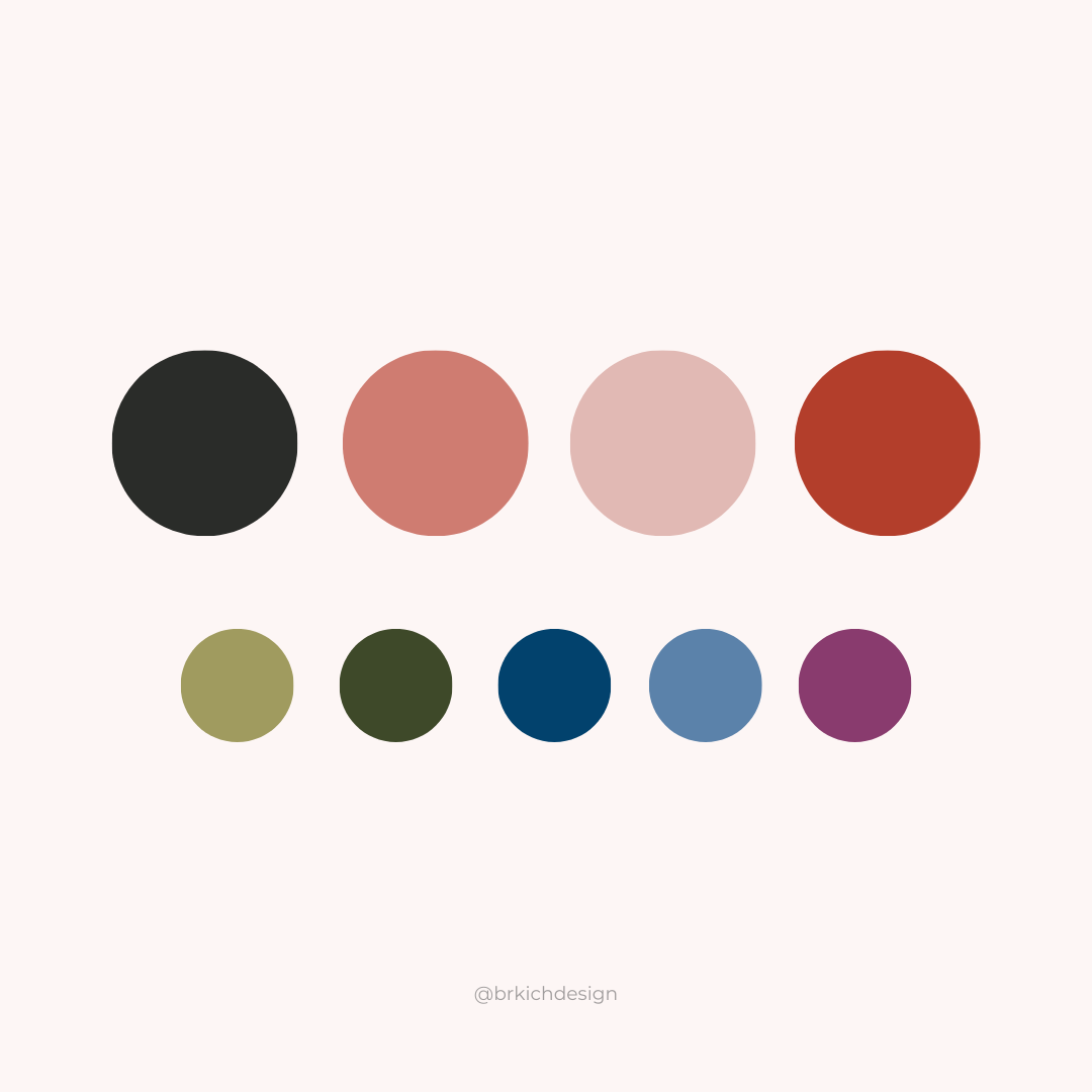
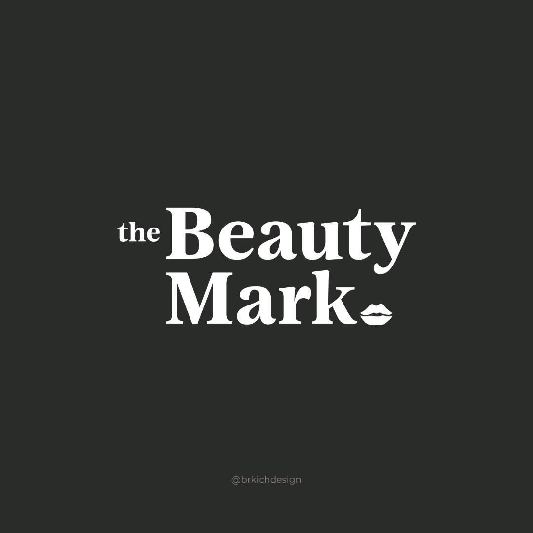
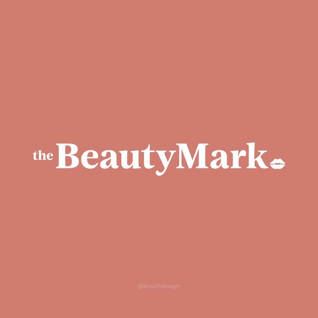
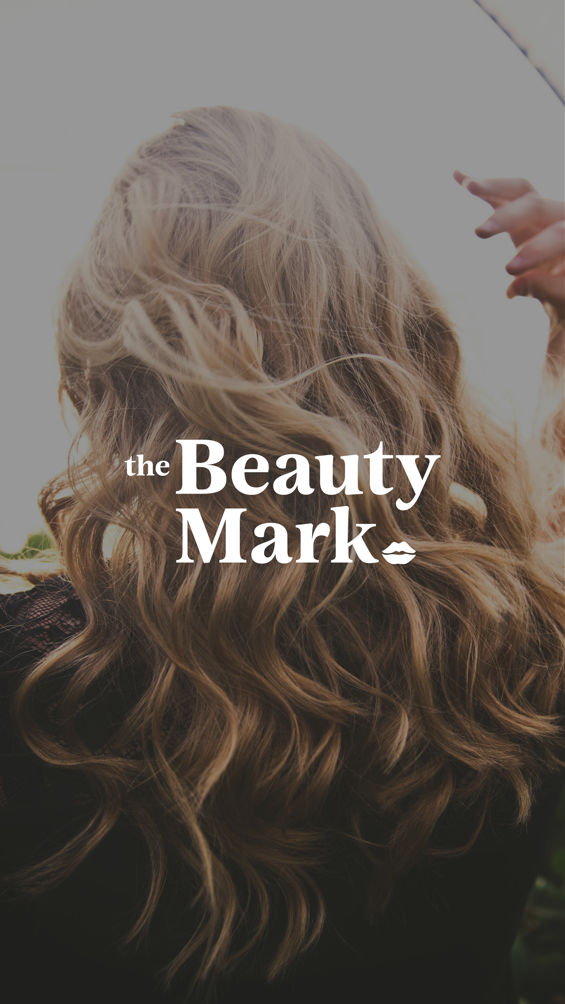
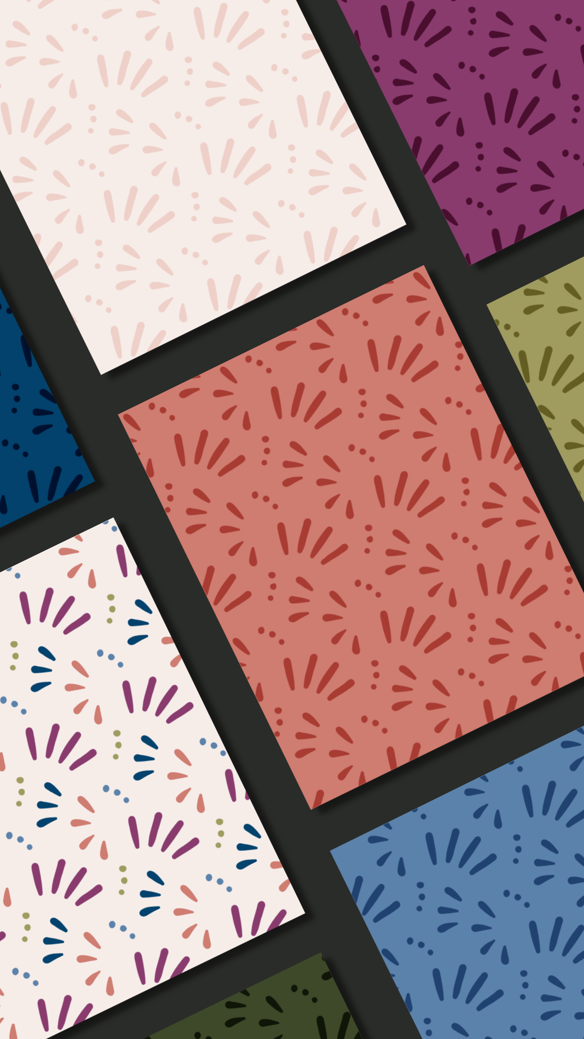
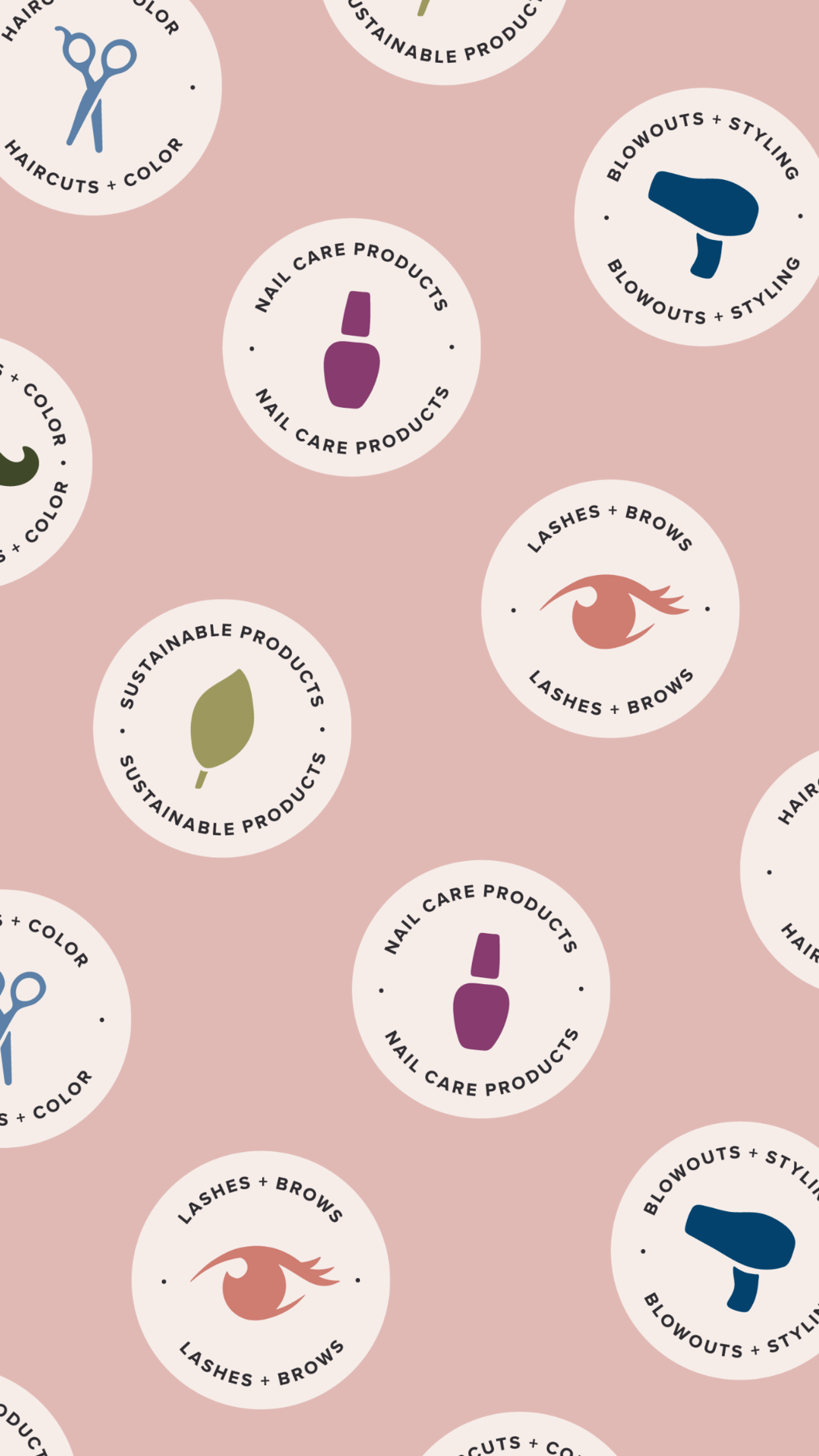
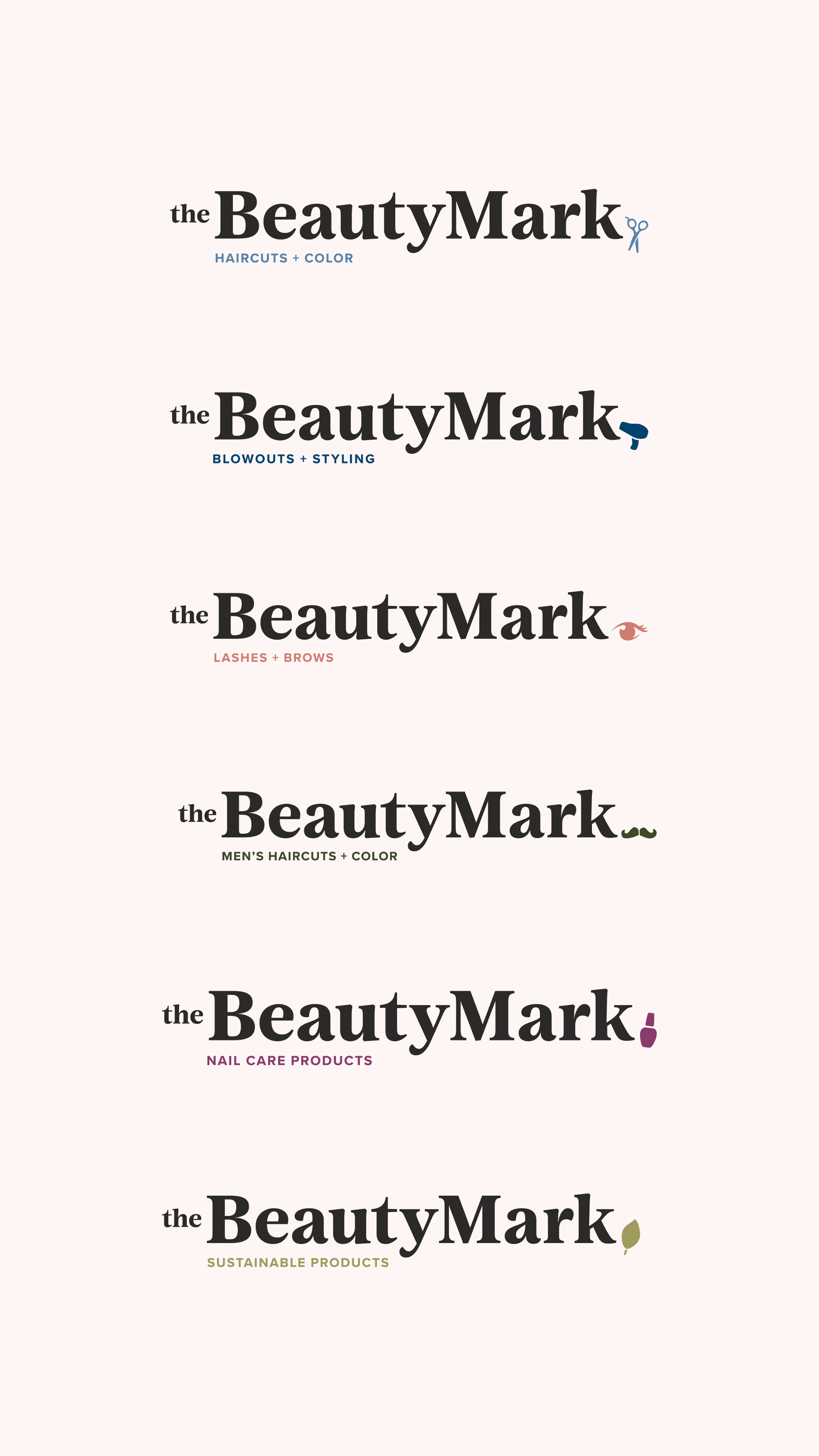
A Brkich Design Group project. The original logo for The BeautyMark featured a pair of red lips. This new concept retains the familiarity of the previous mark, but has been updated to improve legibility and style. We expanded on the concept of a beauty mark by creating custom interchangeable icons, or 'marks', to represent the other services that the salon offers. The fun, hand-drawn pattern is lively. and brings a quirkiness to the visual brand.
My Role: Logo Design, Icon Illustration, Pattern Illustration
Credits:
A Brkich Design Group Project
Art Direction: Cassie Brkich
Designer: Amy Schaffer
Design Support: Karla Zamudio
A Brkich Design Group Project
Art Direction: Cassie Brkich
Designer: Amy Schaffer
Design Support: Karla Zamudio