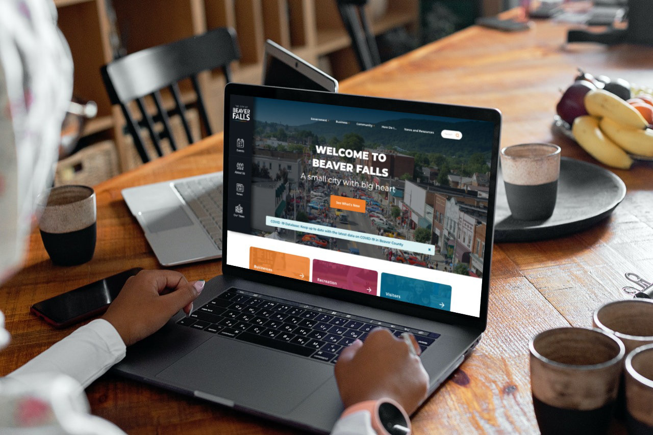
A Brkich Design Group Project. In Beaver County, there are an awful lot of towns with the word 'Beaver' in their name (Beaver, Beaver Falls, Big Beaver, and so on.) Beaver Falls wanted to differentiate themselves and show the county that they're not forgettable ('Where? What was it? Beaver something...?). Beaver Falls is a post-industrial city full of grit with great people and a never-give-up attitude.. The city wanted to be able to communicate its artistic sensibilities, positive change, and exciting recent growth.
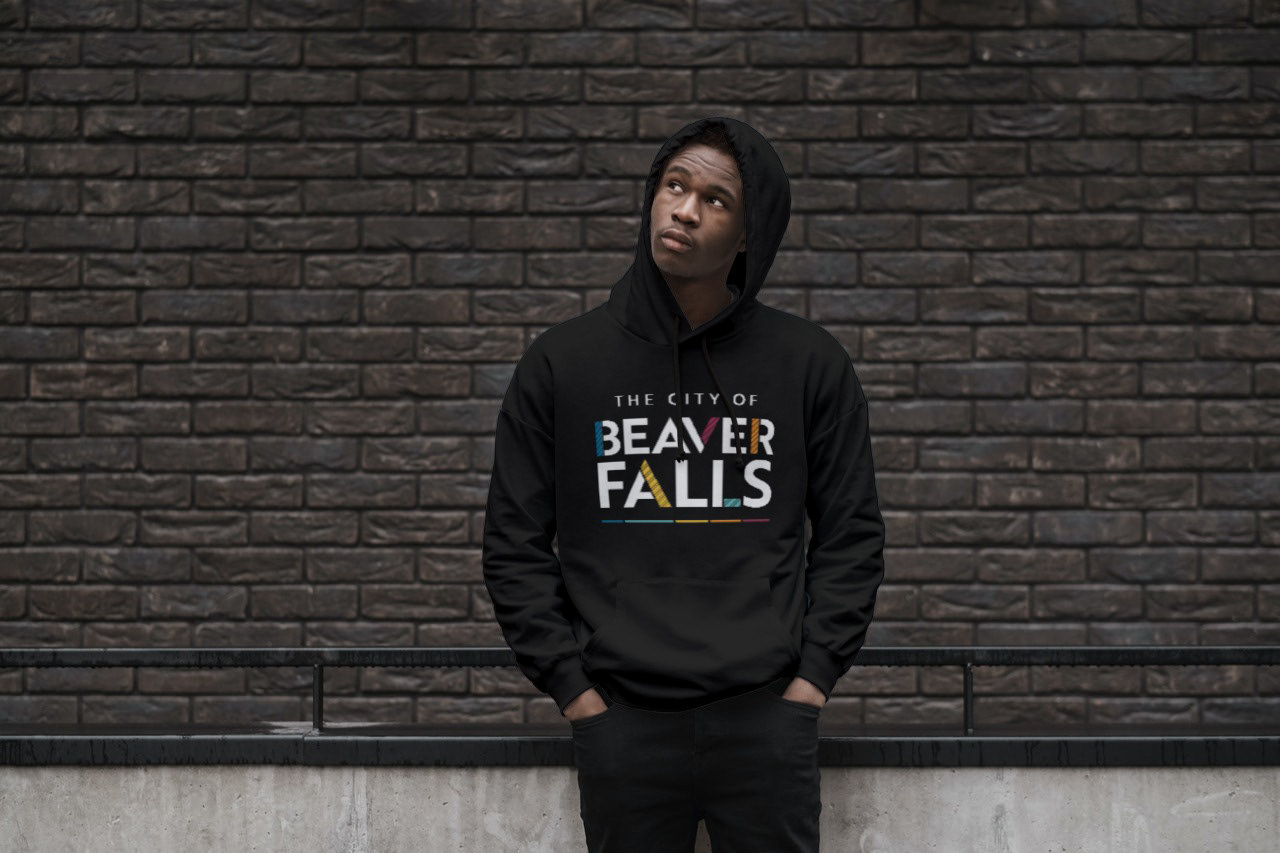
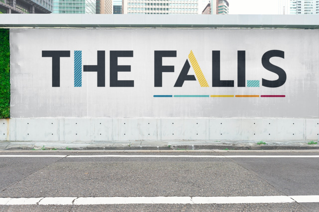
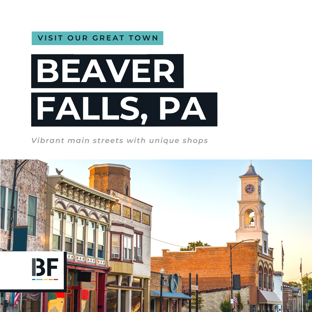
The visual identity features a logo with a colorful underline of the word "Falls" calling out to others that 'The Falls' matters. They're not Beaver, not Big Beaver, Beaver FALLS! And they're proud of it.
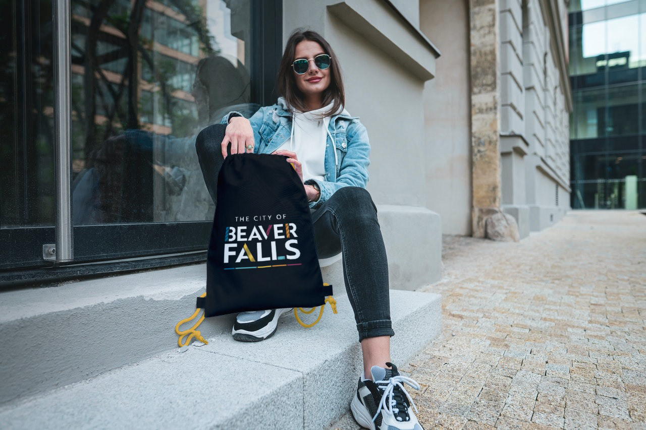
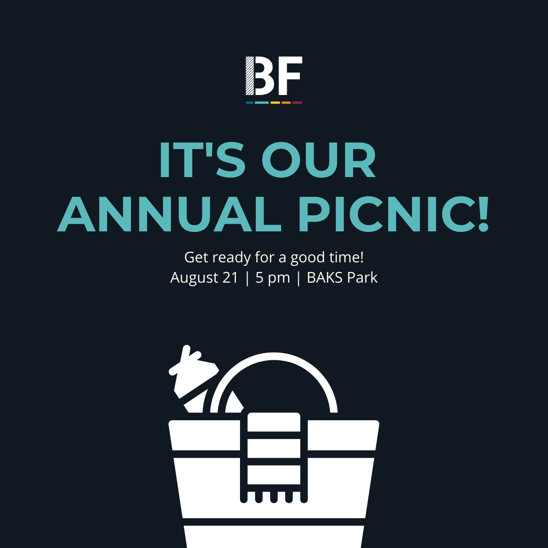
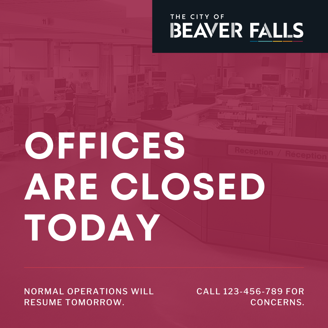
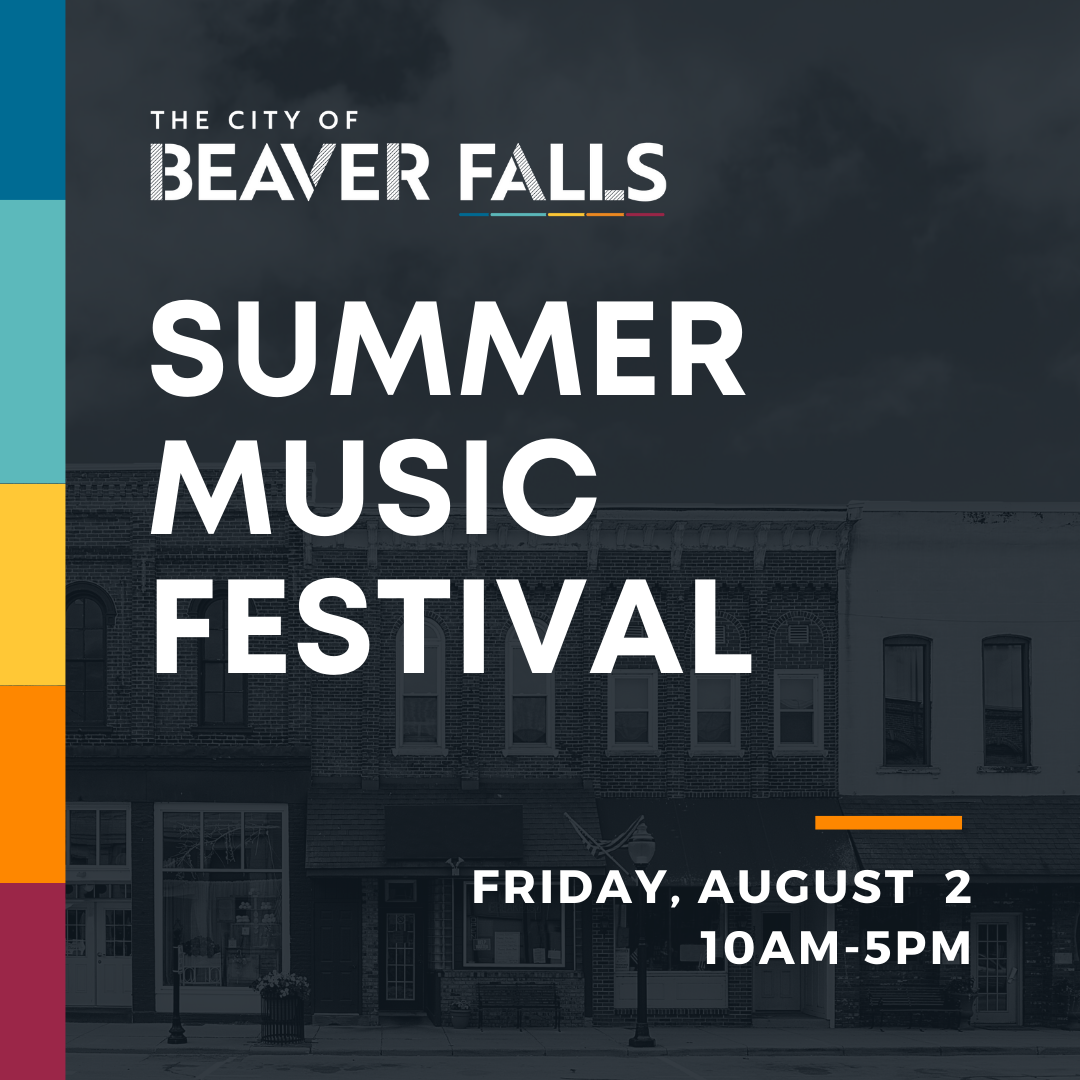
This logo needed to be very versatile and adaptable. It is used for official city/government business as well as for promoting fun city events and community gatherings. To accomplish this, Beaver Falls has a 'serious' suite of logos and a 'colorful' suite of logos (shown in the gif below).
My Role: Logo Design, Art Direction.
Credits:
A Brkich Design Group Project
Client: The City of Beaver Falls
Art Direction: Amy Schaffer
Logo Design: Amy Schaffer
Website Design: Mario Gil-Bueno
Other design support: Karla Zamudio
A Brkich Design Group Project
Client: The City of Beaver Falls
Art Direction: Amy Schaffer
Logo Design: Amy Schaffer
Website Design: Mario Gil-Bueno
Other design support: Karla Zamudio


