It is widely known that many local businesses have struggled to remain open during the 2020-2021 pandemic. According to our market research, “80% of consumers are more likely to shop from a new brand if it has a discount coupon or offer.” (Source: https://savemycent.com/coupon-statistics/).
For these reasons, I chose to create a concept for a mobile couponing app which would help facilitate shopping at small and local businesses in Beaver County, PA and help local business owners create brand awareness.
View the full case study here.
step one: research + discovery
Research Plan • Research Synthesis • Themes + Opportunities • Feature Ideation • Feature Prioritization
USER RESEARCH SYNTHESIS
defining themes and opportunities
My research helped me gain insights into these four main research questions:
• [Needs] What is essential for a couponing app?
• [Behaviors] How do local shoppers use digital coupons?
• Do users really need another couponing app?
• Do users need a better way to find info about small + local businesses? .
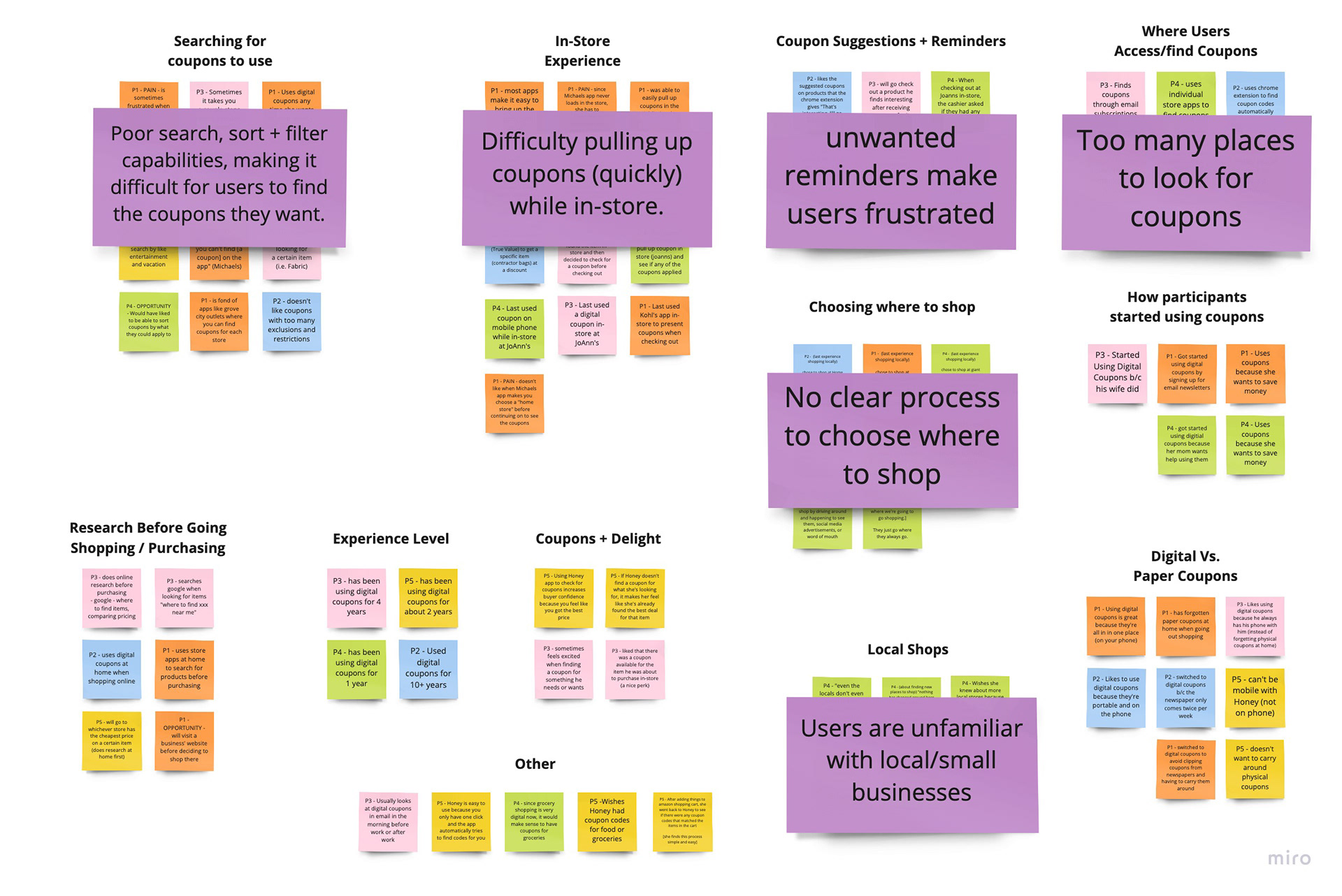

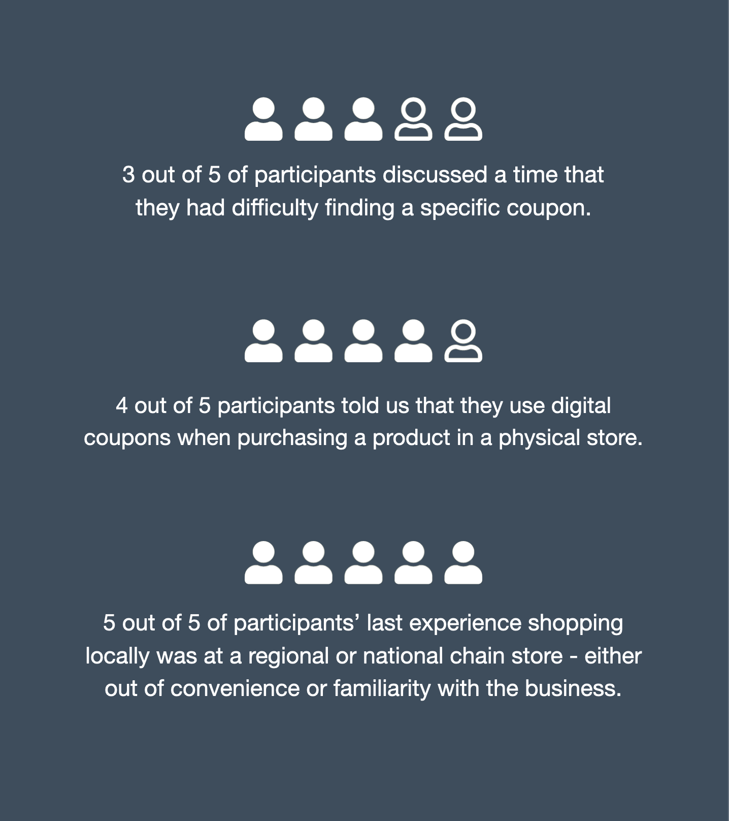
key findings from user research
1.
It is important for users to be able to find + save coupons easily.
2.
Local shoppers often present digital coupons in-store using their phones. It is important to be able to access saved coupons quickly.
3.
Local shoppers may be unaware of small/independent businesses nearby.

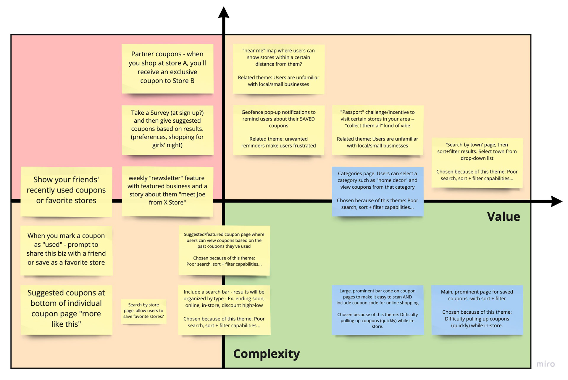
feature ideation and prioritization
I brainstormed possible feature ideas which might address the key research findings.
The chosen features were:
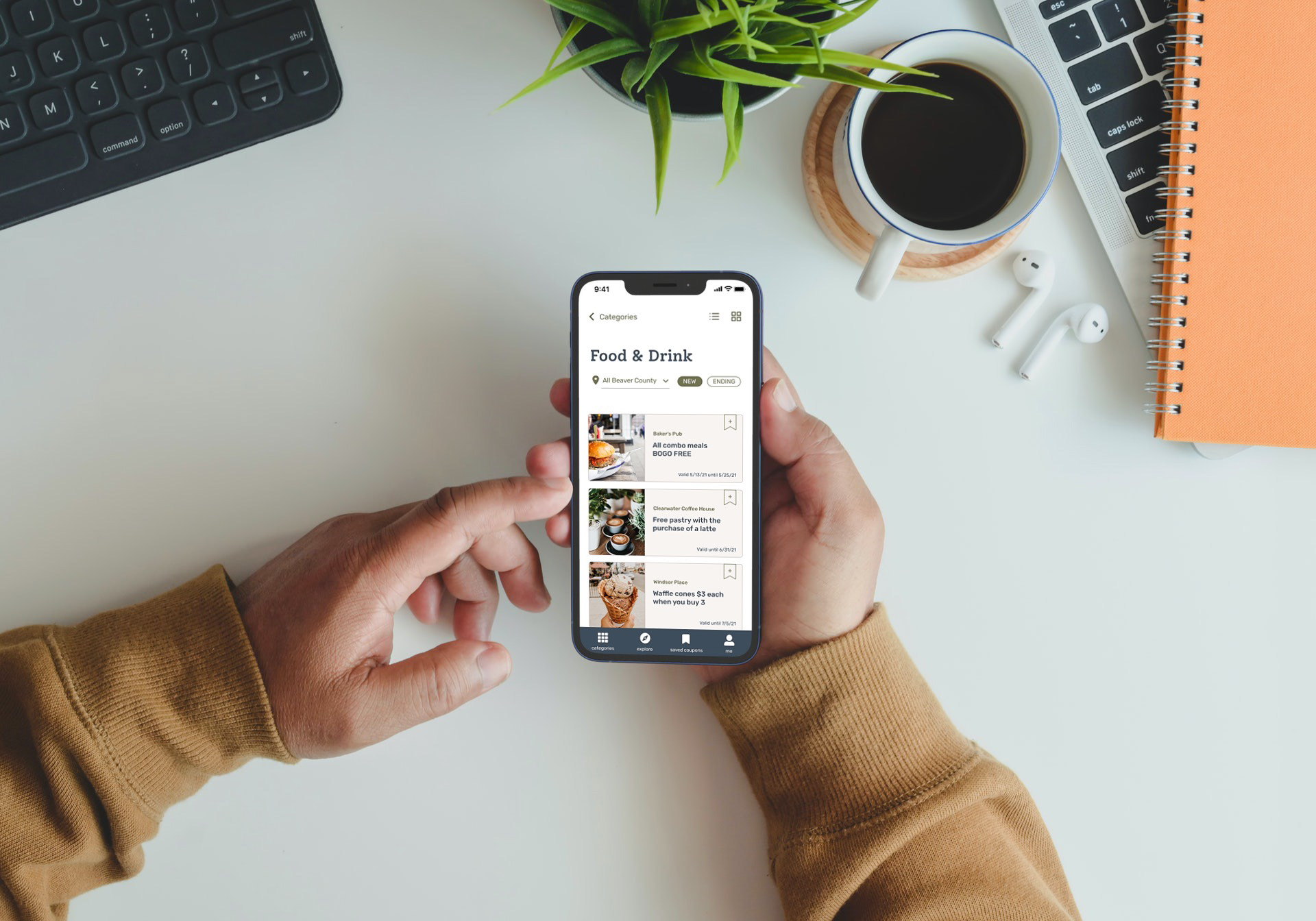
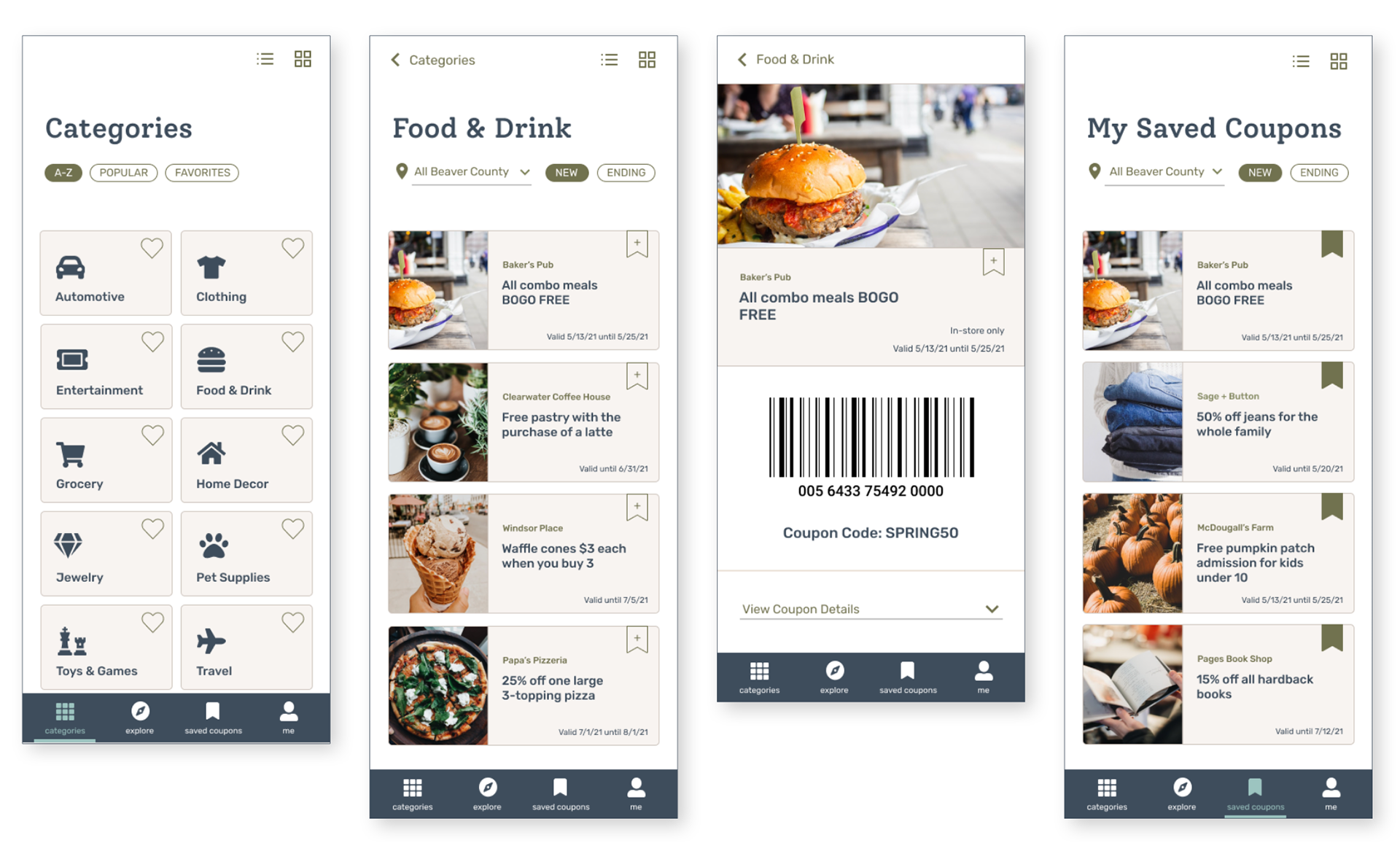
• Categories Page: select + view coupons from a specific category
• Large bar code to easily present coupons in-store.
• Prominent page for saved coupons for quick access
step two: low-fidelity prototype
Paper Sketches • Low-Fidelity Clickable Prototype • Usability Study • Design Iteration
INITIAL SKETCHES
putting it down on paper
Sketches help designers fail fast and iterate quickly. These sketches were my first attempts at incorporating the chosen features into a visual design. Each iteration is more detailed than the last.
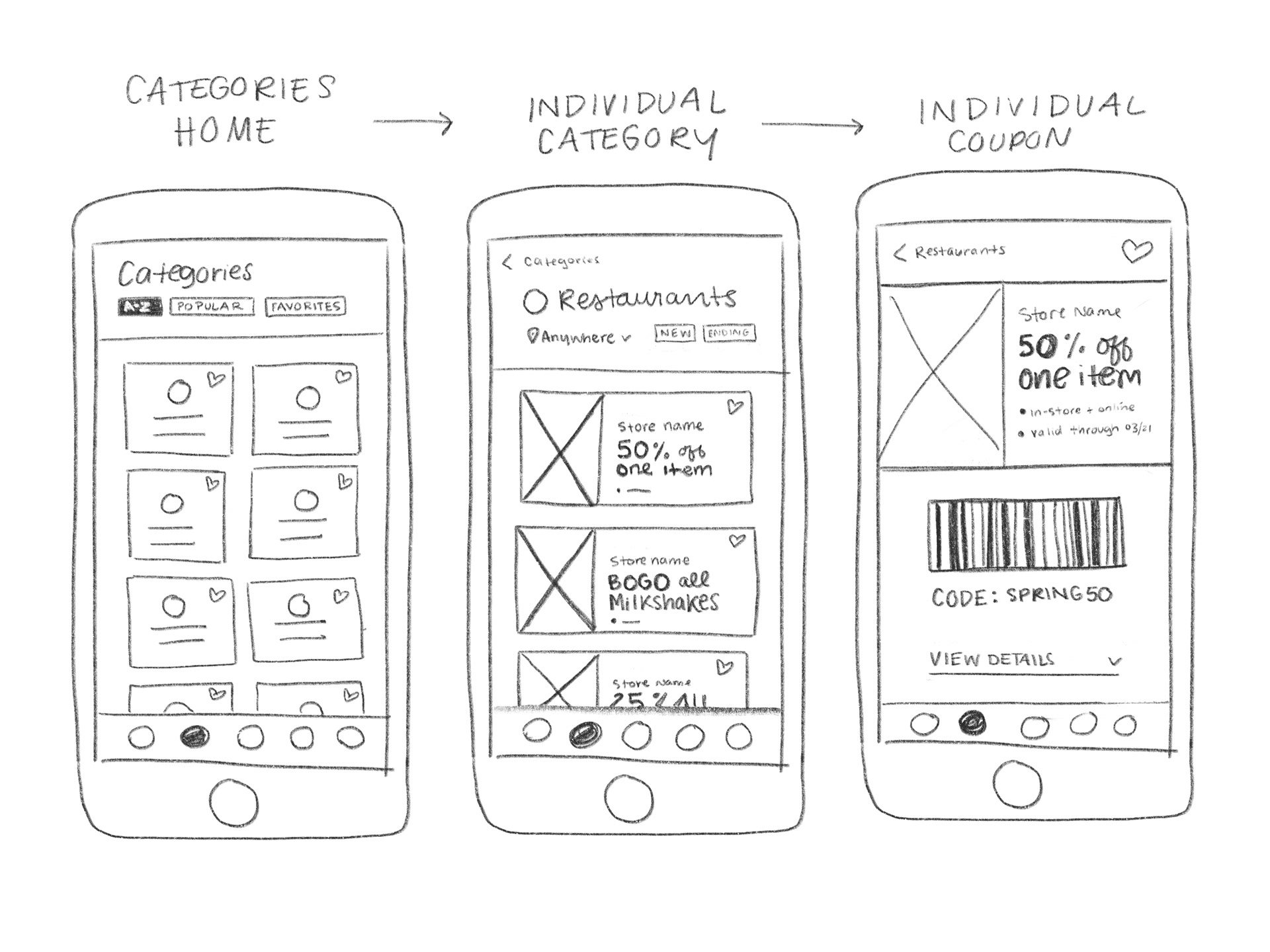

FIRST ITERATION
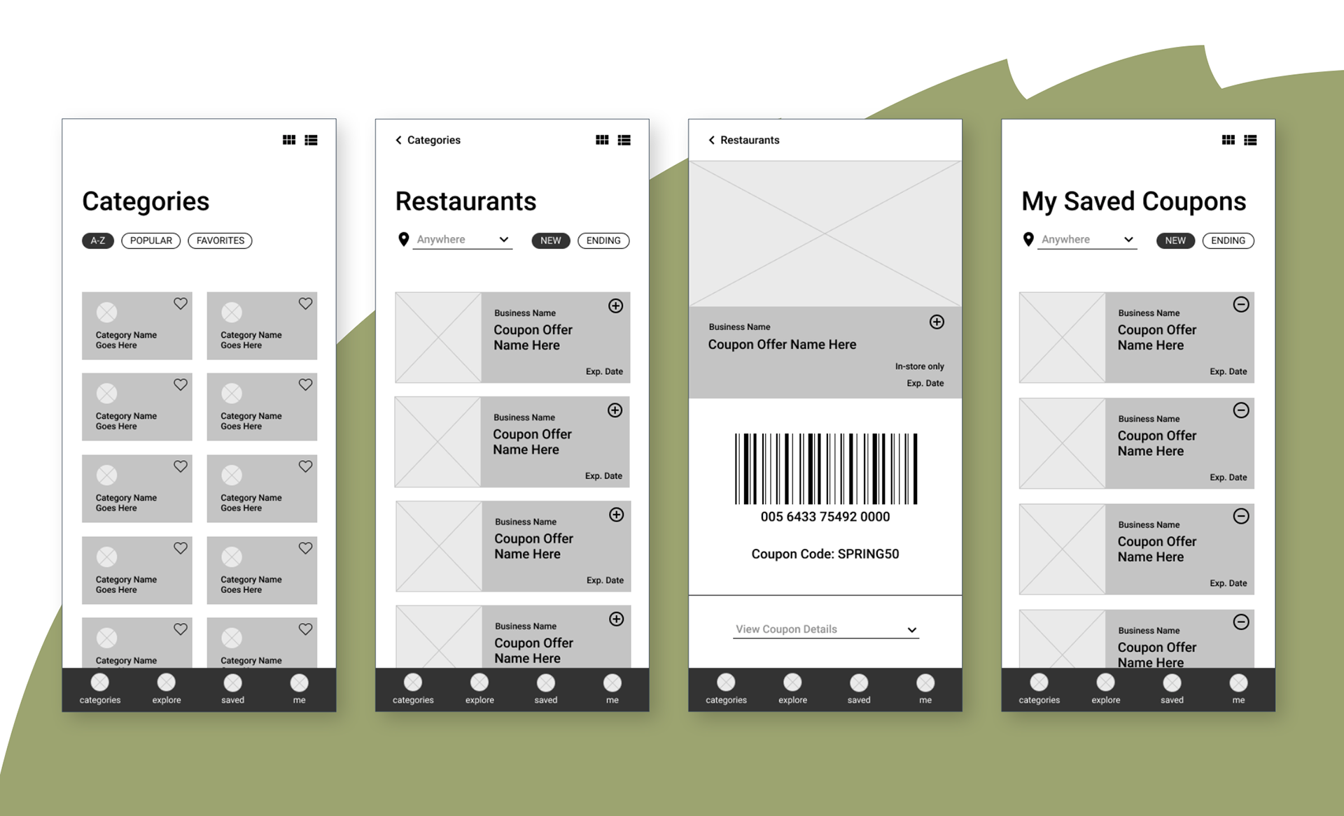
creating a low-fidelity clickable prototype
The next step was to create a digital version of the final sketches using Figma. After creating these wireframes, I linked them together in order to create a clickable prototype.

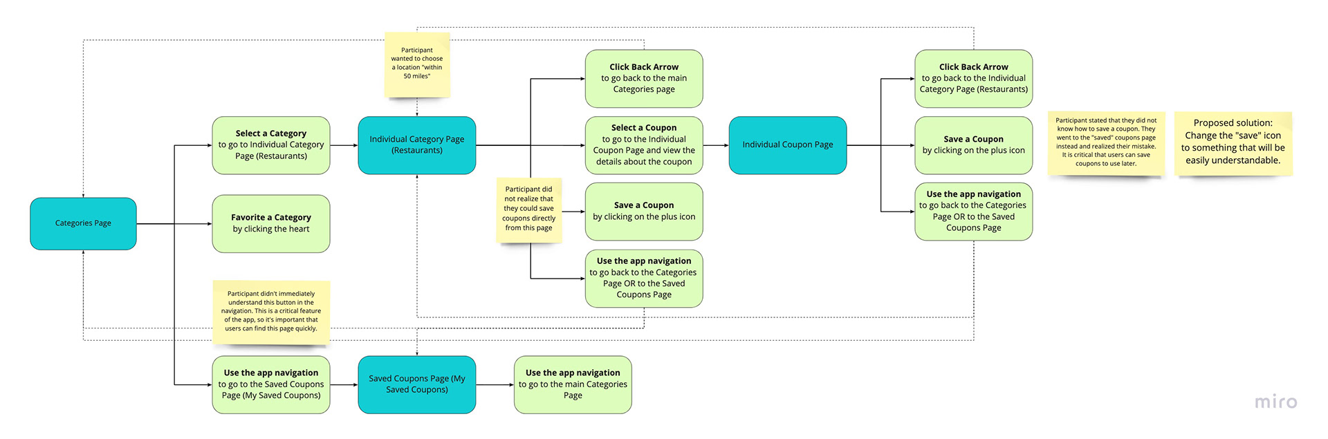
USABILITY STUDY
mapping and testing the
user journey
The low-fidelity clickable prototype was tested with users in order to gain perspective on what may or may not be working well in the design.
Here is a visualization of the key user flow that I developed which depicts all of the possible actions a user can take.
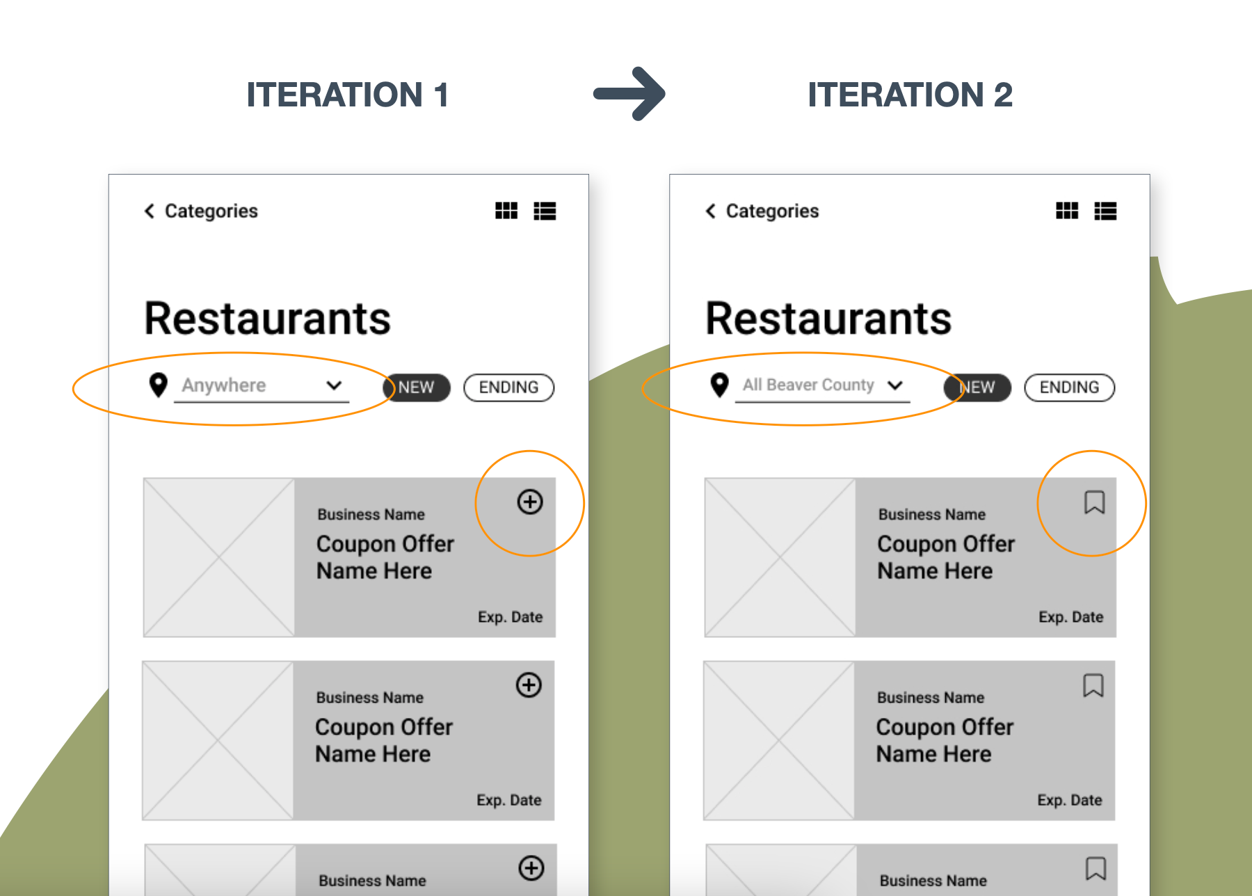
SECOND ITERATION
improving ux writing and the save icon
1.
Participants found the plus/add icon difficult to understand. One participant didn’t understand how to save a coupon at all.
To remedy this, I swapped the “plus” icon for a new “bookmark/save” icon that is more popular and familiar to users.
2.
Participants weren't sure what the location scope was for the filter.
I added more descriptive text that will help the user anticipate what kind of information will be in the drop-down list.
step three: high-fidelity prototype
High-Fidelity Clickable Prototype • Review for Accessibility • Usability Test • Final Iteration
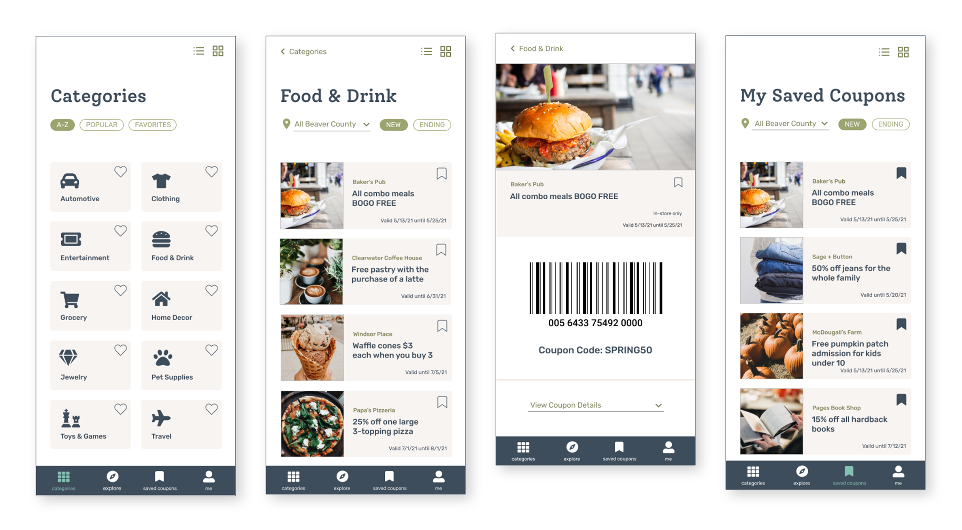
THIRD ITERATION
taking the design from low-fidelity to high-fidelity
A design starts to look and feel more real when the colors, fonts, icons and imagery are carefully chosen and implemented.
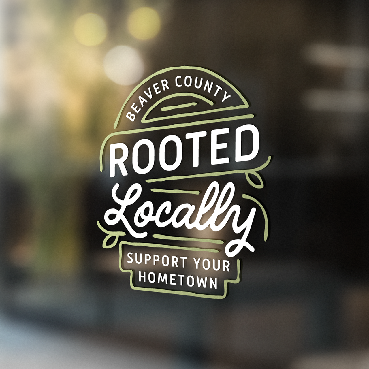
For this app, the visual design elements were chosen to align with the Rooted Locally brand.

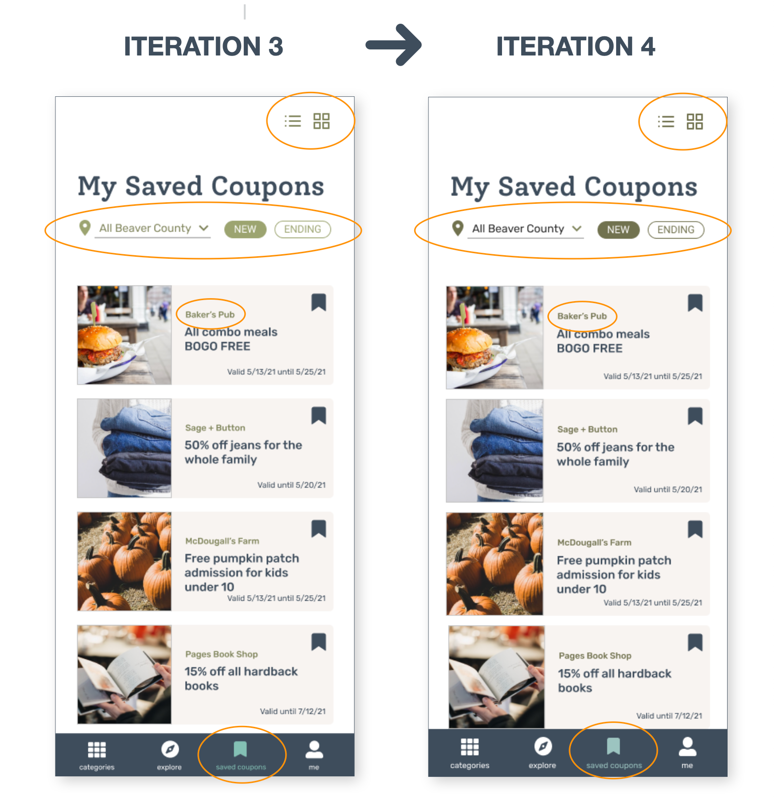
FOURTH ITERATION
checking the design for accessibility
Navigation Bar
I made navigation bar taller and increased text size. Then, I increased distance between two buttons in the top-right corner to make them easier to tap
Color Contrast
Checked the color contrast against WCAG (Web Content Accessibility Guidelines) and adjusted failing combinations.

USABILITY TESTING
testing the clickable prototype using Lookback
8 participants self-tested the following tasks:
• Select category
• Select a coupon to view details
• Save a coupon (either from “Food & Drink” page or Individual Coupon Page
• View saved coupons
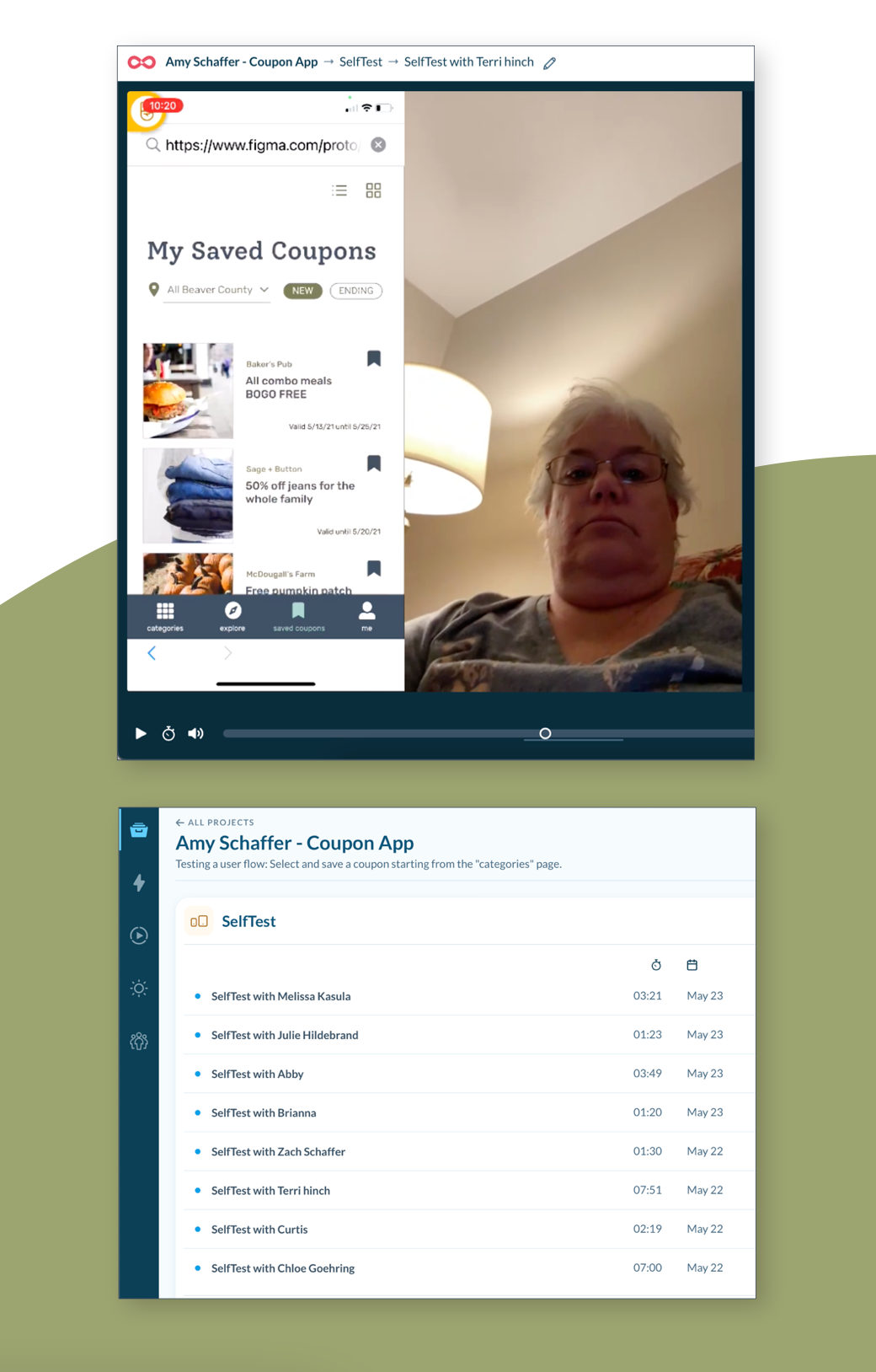

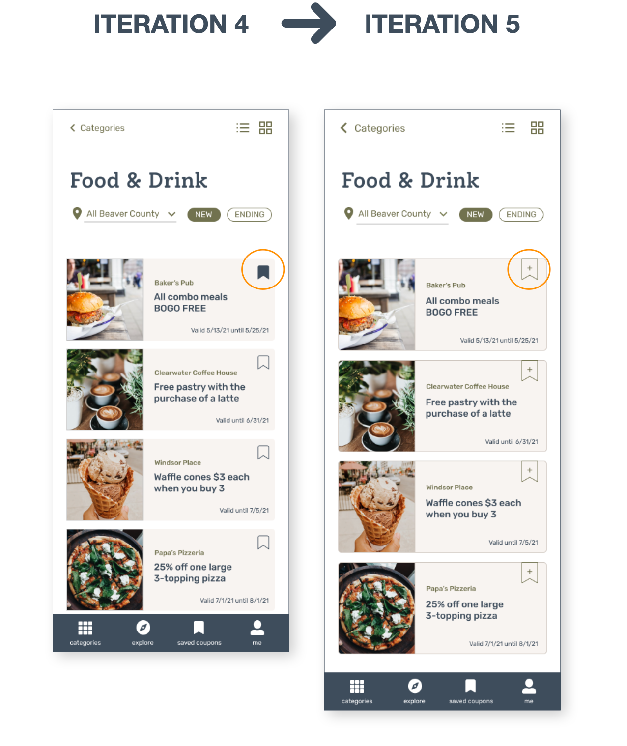
IMPROVE USING KEY PERFORMANCE INDICATORS
75% of users had difficulty saving a coupon on the first attempt
I would like to increase the task success rates of the following task:
Save a coupon - Users either didn’t understand the “bookmark” save icon, or they were unable to tap the icon when they tried.
Hypothesis:
If I add a plus symbol (+) to the bookmark icon to symbolize “adding” and increase the size of the icon, users will not have difficulty saving a coupon.

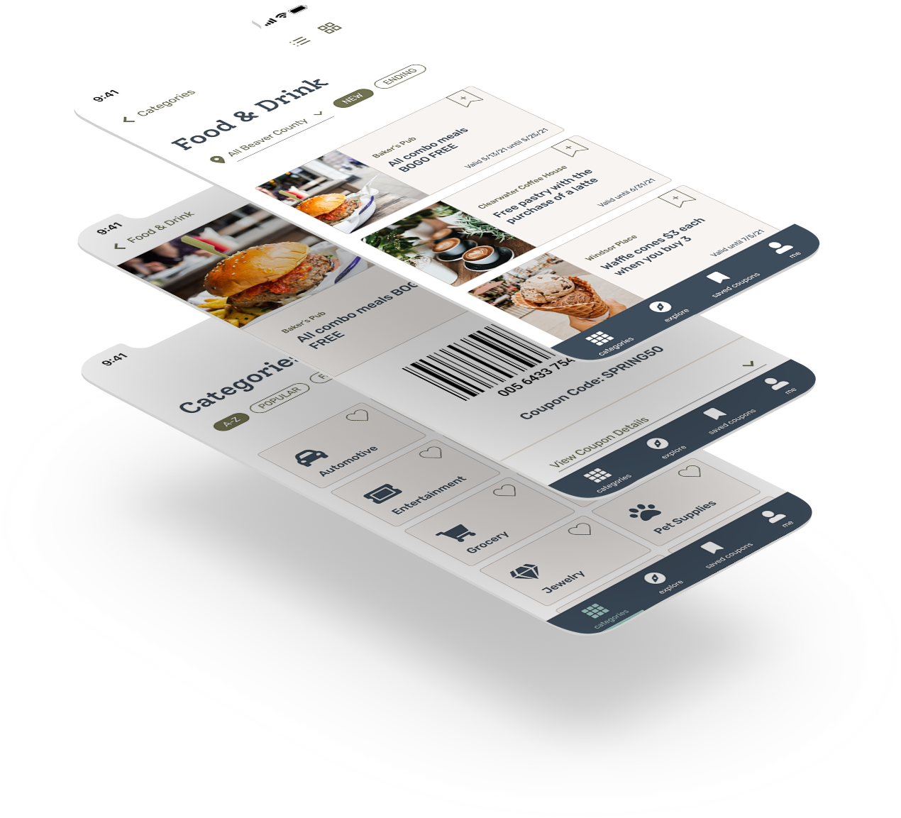
FINAL PROJECT
view the final Figma prototype
REFLECTION
solution and impact overview
Overall, I believe this solution for the Rooted Locally coupon app will effectively rise to the challenge of facilitating local shopping in Beaver County, PA.
The most challenging problem I had to solve was making sure users were able to save coupons easily. Saving coupons is one of the most important functions of the app! I went through several different “save” icons to find a solution that was clear to the users.
Credits:
Date: Spring 2021
Designer: Amy Schaffer
Duration: 12 weeks
Tools: Figma, Miro, Zeplin, Lookback
Coursework from: Udacity User Experience Design Nanodegree