
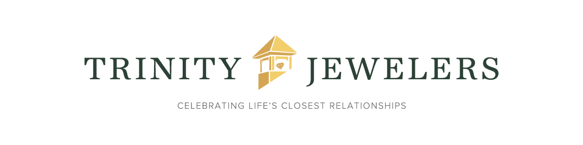
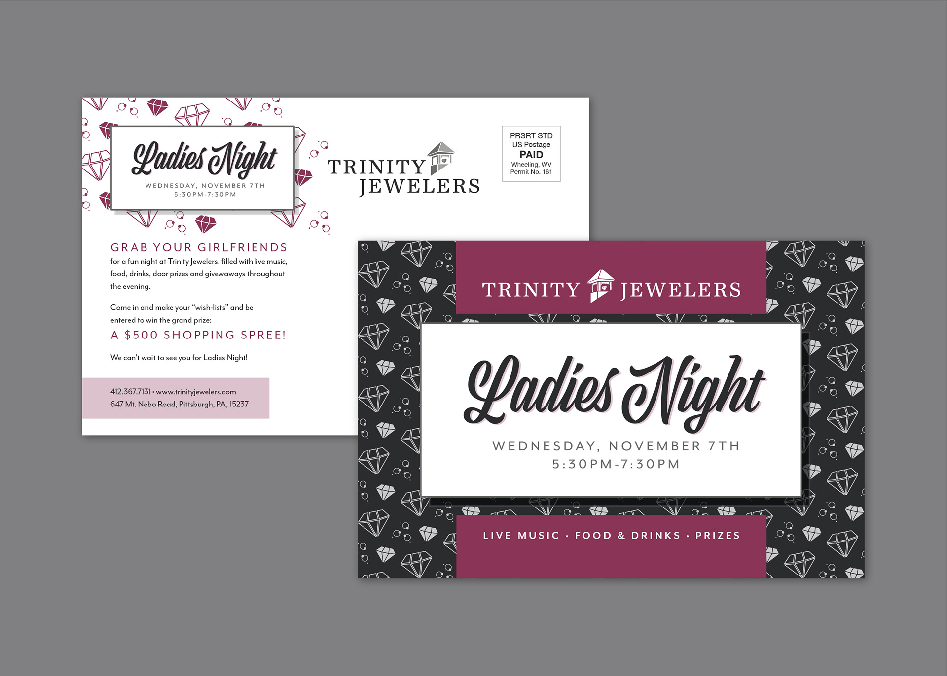
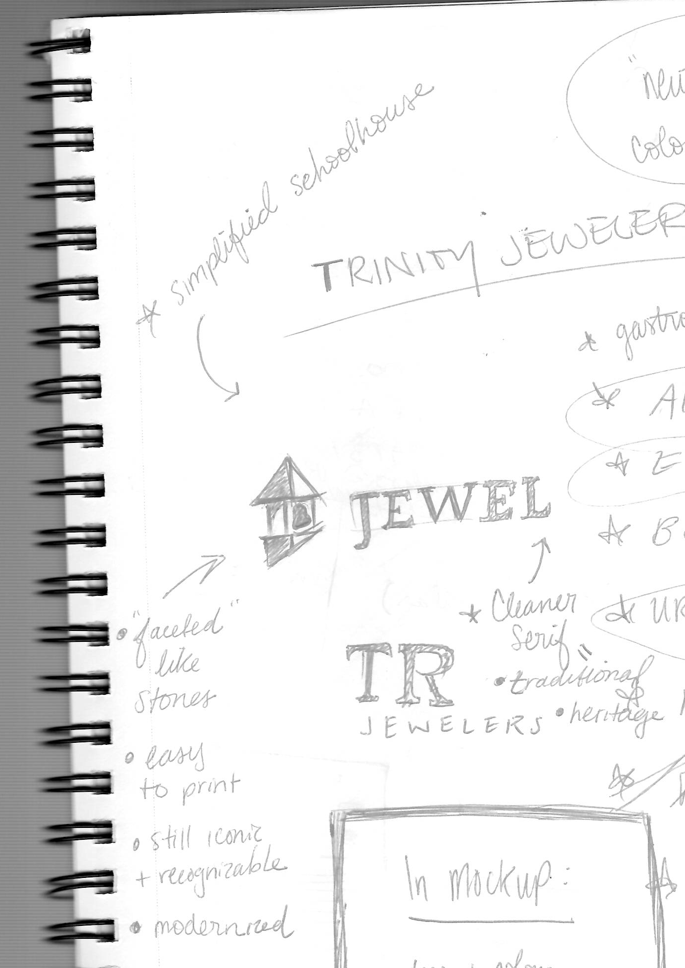
This brand refresh gives new life to a beloved local jewelry store. The new design features a simplified icon which can be easily reproduced at smaller sizes and translates well into special processes often used by Trinity, such as foil-stamping. The schoolhouse's original green and gold colors have been preserved and refined to offer a high-end look. Completed with a traditional, serif typeface, the new identity system will better suit the luxury jewelry industry.
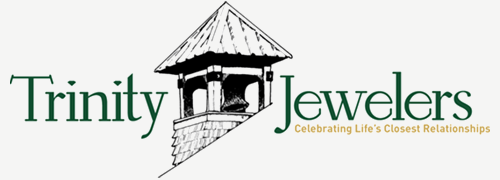
Before:
After:


Credits:
Year: 2017-19
Client: Trinity Jewelers
Designer: Amy Schaffer
Typefaces: URW Antiqua, Proxima Nova, AcroterionJF
Photos & text belong to Trinity Jewelers.